ROC versus CAP
by Richard in18 Apr 2018
Recent consulting work in the banking sector has led me to take a closer look at the ROC and CAP curves and their associated accuracy measures, AUC and AR. I was rather surprised to learn that there is a simple relationship between these measures. However, it seems that it is also not quite as simple as people think.
Introduction
The ROC and CAP curves measure the quality of a ranking or rating system. They are not defined for an arbitrary predictive model, but rather for models which output some kind of numerical score which is supposed to be predictive of some characteristic of interest. This means, for example, that a random forest or naive Bayes classifer can have an ROC curve, but a black-box classifier which merely produces a prediction will not have one.
The application which I will have in mind in this post is credit scoring. A credit scorecard outputs a number called a credit score. Every borrower is assigned a credit score. Some borrowers are “bad”, for example, those who default. It is hoped that the credit score will be related to the probability that a borrower is bad. The ROC and CAP curves provide a way to test this.
The ROC curve
The ROC curve is more widely known than the CAP curve. The idea behind the ROC curve is that we can build various different predictive models by choosing a cutoff, with scores below the cutoff being classified as bad and those above the cutoff being classified as good.
This involves a tradeoff. If the cutoff is too low, then everyone will be classified as good. This means that none of the goods will be misclassified, but none of the bads will be detected. On the other hand, if the cutoff is too high, then everyone will be classified as bad. This means that all of the bads will be detected, but all of the goods will be misclassified as well, which is undesirable. The cutoff must be chosen somewhere in between.
Originally, the ROC curve was developed for radar applications. ROC stands for “Receiver Operating Characteristic”. I believe the original application was something like deciding whether to shoot down a plane. If the cutoff is too low, then enemy planes get through, but if it is too high, then you shoot down your own planes.
(By the way, shooting down your own planes is called a Type 1 error, and letting enemy planes through is called a Type 2 error. There is an easy way to remember which is which if you know the story of the boy who cried wolf. The boy who cried wolf when there was no wolf was committing a Type 1 error, and this happened first. The villagers who refused to believe that there was a wolf when there really was a wolf were committing a Type 2 error.)
Example
Say there are 5 cases, with scores of 100, 200, 300, 400, 500, and the cases with scores of 100 and 300 are bad. Then if we choose a cutoff of 150 (so we predict that everyone below 150 is bad) then we correctly predict one bad and incorrectly let one bad slip through. We correctly identified 50% of the bads, and we misclassified 0% of the goods.
On the other hand, if we choose a cutoff of 350, then we would correctly identify 100% of the bads, but we would also misclassify 33% of the goods.
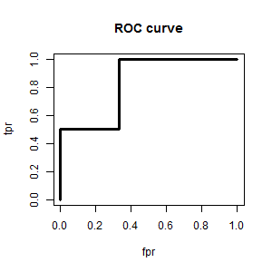
The ROC curve is constructed by considering every possible cutoff, and plotting the proportion of misclassified goods (also called the False Positive Rate, or Type 1 error rate) on the x-axis and the proportion of correctly classified bads (also called the True Positive Rate) on the y-axis.
In our example, by considering every possible cutoff, we get the following table:
| cutoff | <100 | 100-200 | 200-300 | 300-400 | 400-500 | >500 |
|---|---|---|---|---|---|---|
| bads < cutoff | 0 | 1 | 1 | 2 | 2 | 2 |
| goods < cutoff | 0 | 0 | 1 | 1 | 2 | 3 |
| tpr | 0 | 1/2 | 1/2 | 2/2 | 2/2 | 2/2 |
| fpr | 0 | 0 | 1/3 | 1/3 | 2/3 | 3/3 |
and the ROC curve looks like this (the points are joined up to create a curve, for ease of visualization).
Uses of the ROC curve
The ROC curve is mainly used for two things. Firstly, it can be used to produce a classifier from a ranking system, by choosing a cutoff. Usually, the cutoff is chosen so that the corresponding point on the ROC curve is as close as possible to (0,1), which represents a perfect classifier (false positive rate is zero and true positive rate is 1). Depending on the application, it might be desirable to tradeoff fpr and tpr in some other way, and the ROC curve gives a way to view these tradeoffs.
AUC
Secondly, the ROC curve can be used to measure the quality of a ranking system. This is usually done by calculating the area under the ROC curve, called AUC or AUROC. Note that this number measures the quality of a ranking system. It doesn’t make sense to talk about the AUC of a classifier.
The AUC seems like quite a complicated measure, but actually it has a very simple interpretation. It is the probability that a randomly-drawn good instance has a higher score than a randomly-drawn bad instance (tied scores have to be dealt with separately). Equaivalently, it is the proportion of (bad, good) pairs in which the good case has a higher score than the bad case.
The highest possible value of the AUC is 1, and the lowest possible value in practice is 0.5, which corresponds to a ranking system with no discriminatory power. It is possible to have an AUC of less than 0.5, but in this case, the rankings can be reserved, to give an AUC greater than 0.5.
Gini Index
Sometimes the Gini Index is used instead of the AUC. This is obtained by subtracting the area above the ROC curve from the area under the curve. Since the ROC curve fits into the unit square, the Gini Index satisfies the equation
\[\mathrm{Gini} = 2\mathrm{AUC} - 1.\]The CAP curve
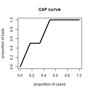
The CAP curve is much simpler to explain than the ROC curve. It is obtained by plotting the cumulative proportion of bads on the y-axis against the cumulative proportion of all cases on the x-axis. In the above example, it is computed like this.
| score | 100 | 200 | 300 | 400 | 500 | 600 |
|---|---|---|---|---|---|---|
| bad | 1 | 0 | 1 | 0 | 0 | 0 |
| proportion of bads | 1/2 | 1/2 | 2/2 | 2/2 | 2/2 | 2/2 |
| proportion of cases | 1/6 | 2/6 | 3/6 | 4/6 | 5/6 | 6/6 |
When plotting the CAP curve, note that the point $(0, 0)$ is also included.
Accuracy Ratio (AR)
Like the ROC curve, the worst possible CAP curve is a 45 degree line, which will be the CAP curve of a random ordering of goods and bads. The best possible CAP curve would rank all the bads first, followed by all the goods. This would follow a straight line from $(0, 0)$ to $(b/n, 1)$ where $b$ is the number of bads and $n$ is the number of cases, followed by the line segment from $(b/n, 1)$ to $(1, 1)$.
In pictures, the situation looks like this.
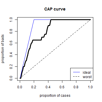
Let $AUCAP$ be the area under the CAP curve. Then the number $AUCAP - 1/2$ measures how much better the ranking system is than a random model, and the area under the blue curve, $(1 - \frac{b}{2n}) - 1/2$, is its maximum possible value. The Accuracy Ratio is defined to be
\[AR = \frac{AUCAP - 1/2}{1/2 - b/2n}.\]It has the advantage that it lies between 0 and 1.
Relationship between CAP curve and ROC curve
You may notice that the CAP curve and ROC curve look very similar. In fact, they have the same values on the y-axis (cumulative proportion of bads) and when the CAP curve goes diagonally upwards with a slope of $b/n$, the ROC curve goes vertically upwards, like in this nifty animation.
The CAP curve has some advantages over the ROC curve.
- It is easier to explain.
- It is always the graph of a function (no vertical bits).
- AR lies between 0 and 1.
Relationship between AR and AUC
It is not surprising that AR and AUC are closely related. In fact, Appendix A of this discussion paper by Engelmann, Hayden and Tasche shows that
\[AR = 2AUC - 1,\]so that in fact the accuracy ratio is the same number as the Gini Index. Here is another article by the same authors with a slicker proof.
However, in practice there is one caveat. The result is only true if there are no ties in the ranking, because it is based on viewing the CAP as defined by the points $(n_{\le i}/n, b_{\le i}/b)$ as $i$ ranges over all possible scores, and $b_{\le i}$ is the number of bads with score $\le i$, and $n_{\le i}$ is the total number of cases with score $\le i$.
If the CAP curve is defined by plotting the proportion of cases on the x-axis (as in this post) then the relationship will no longer hold true, although in any sensible example it will be close enough for all practical purposes. It is worth being aware of this in case it gives rise to awkward questions!